Visual Identity
Hausmann
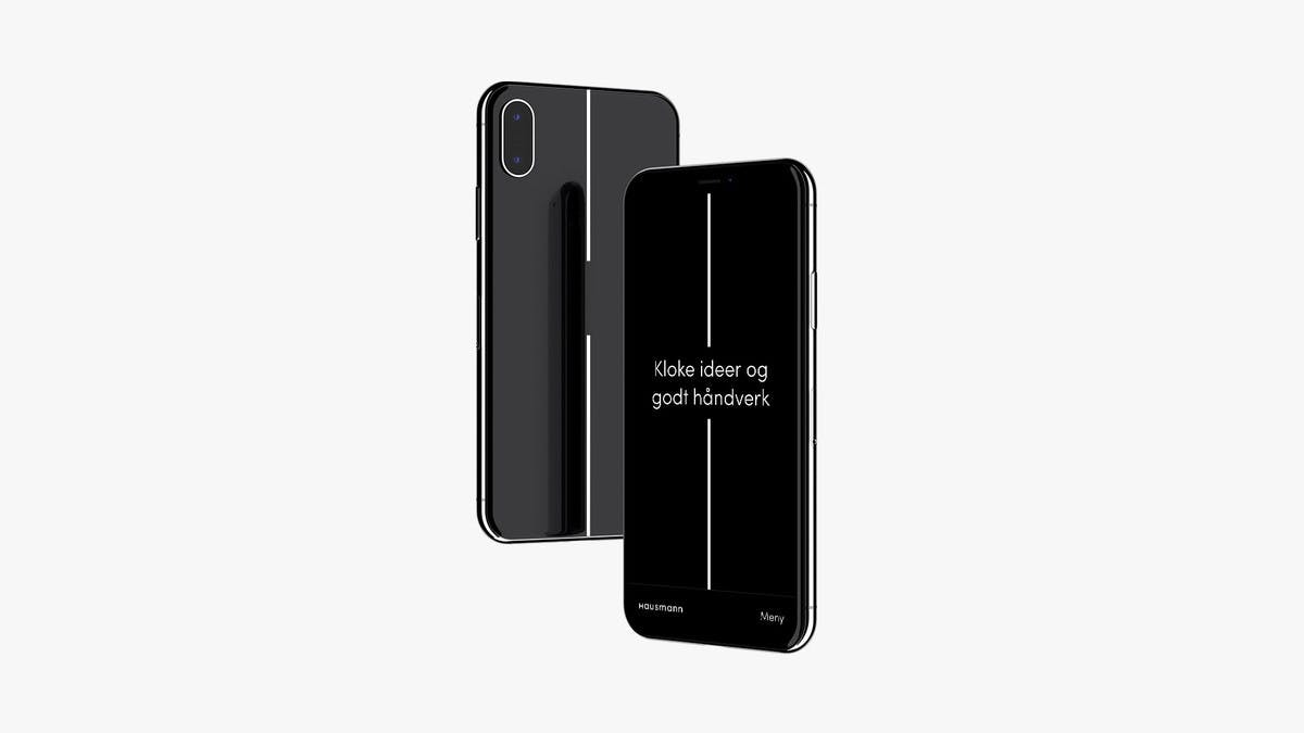
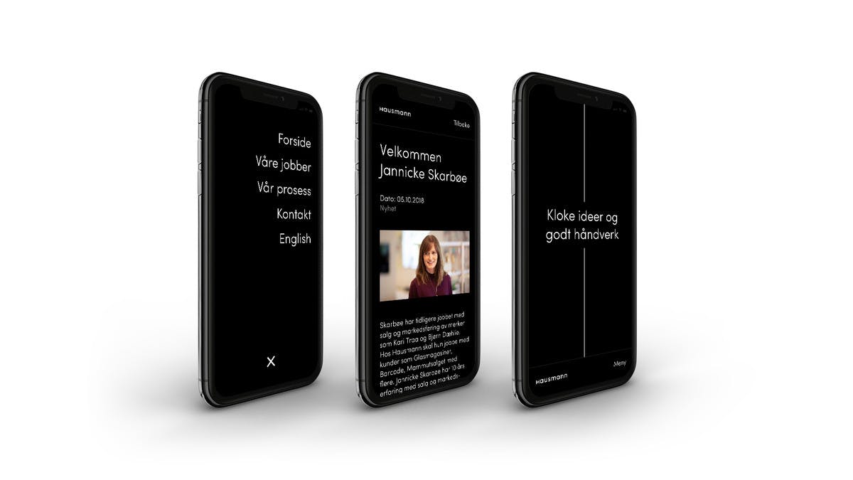
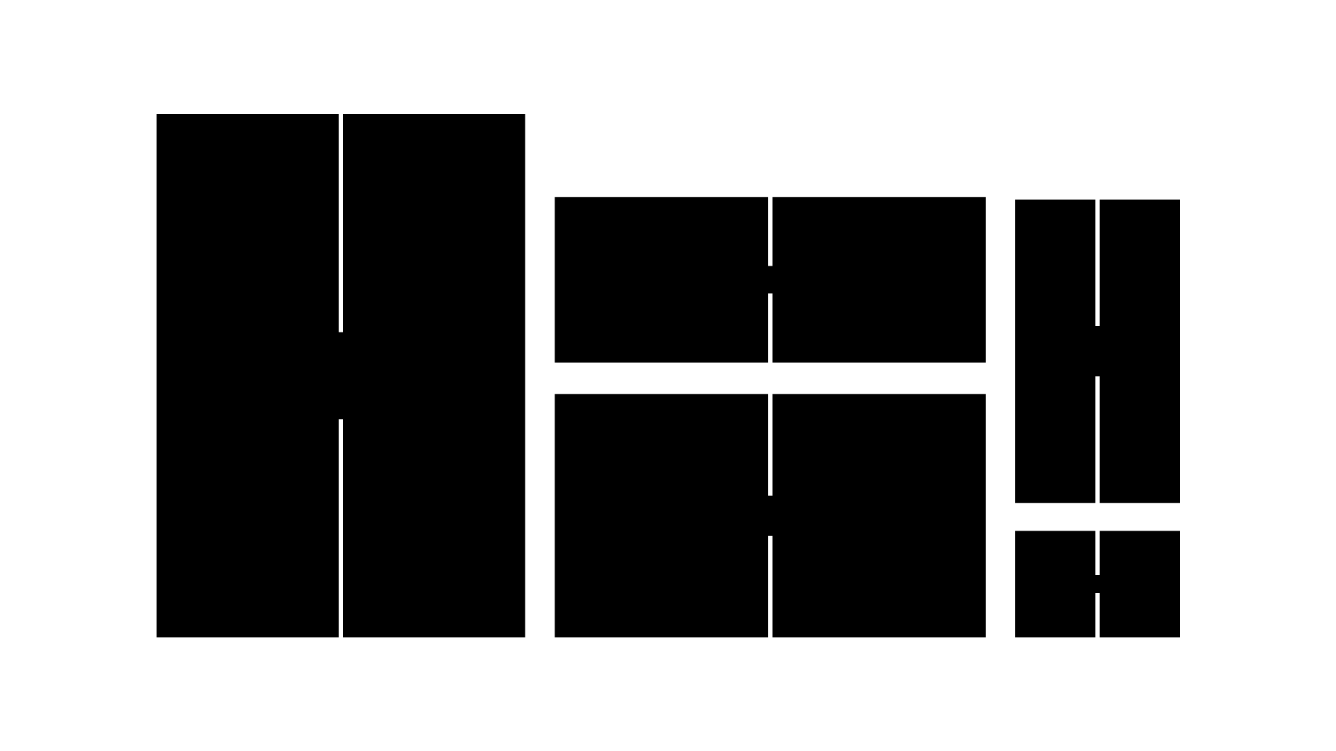
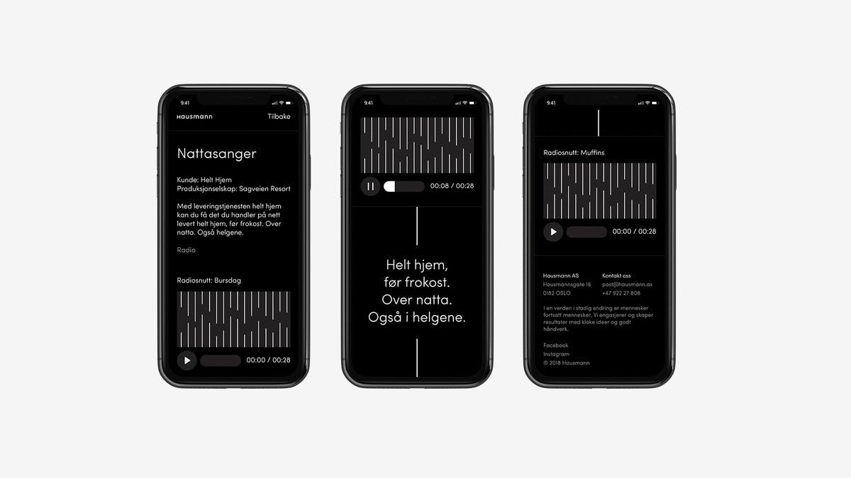
The silent H
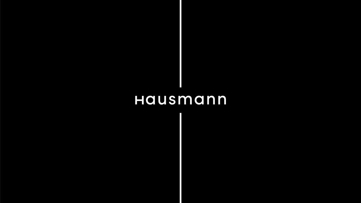
Hausmann is a Norwegian award winning advertising agency. They recently changed their name from Llowbank to Hausmann and needed a new identity. Since their work revolves around getting other brands to shine, they wanted a subtile visual identity, silently leaving their mark in every channel their where present. This resulted in the silent H, two simple strokes dividing any format into an H. It can be use alone or with the logotype. The Silent H can also be used as pointers to a message or title of a job. This simple system is strong but lets the focus be on the work Hausmann do.