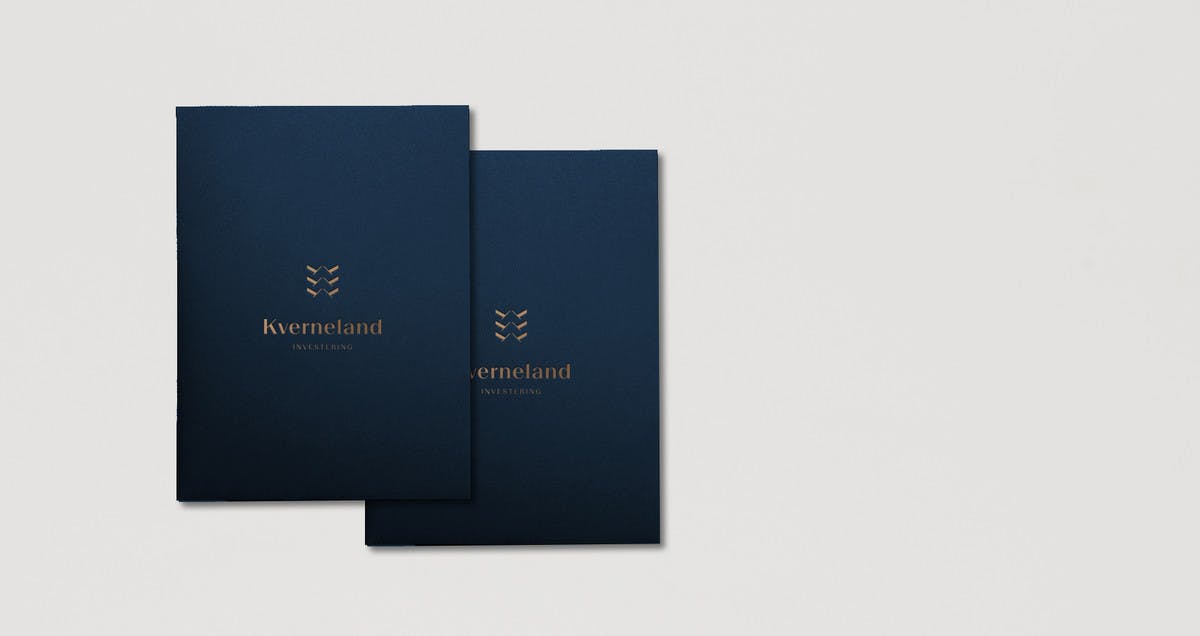
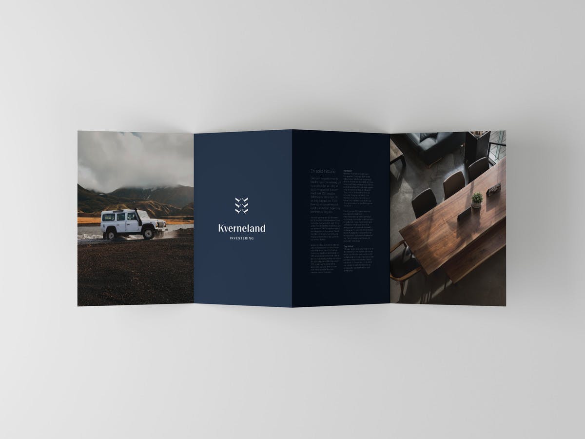
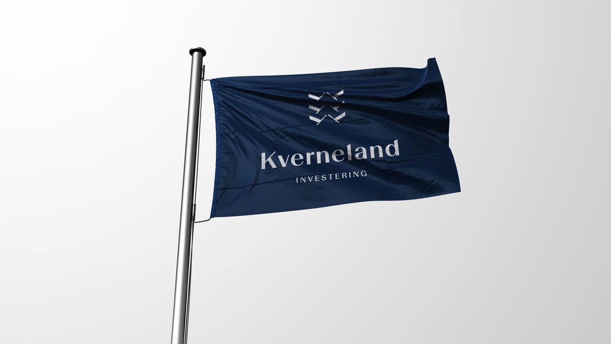
Visual Identity
Kverneland Investering
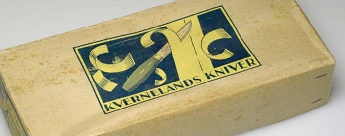
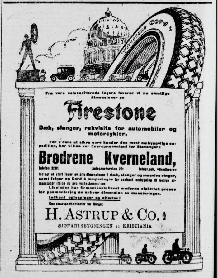
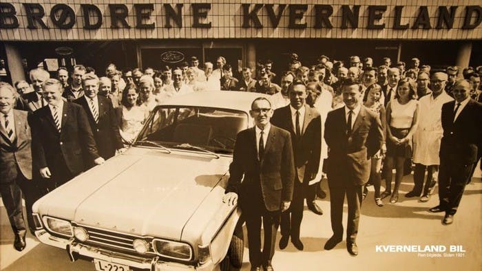
Business since 1921
Brødrene Kverneland was established in 1921 and has since the beginning been known for handling car sales. The company are now changing their name to Kverneland Investering (Kverneland Invest) to redirect the focus and to show all the different areas they invest, like property development, restaurant operation, accounting and tracking.
The logo is inspired by Art Deco sign-fonts in old pictures from the 1920s and the symbol is a simplified tire track made out of the K, to bring some of the history of the company into the future. Strong and corporate with a touch of history.
My role: Visual Identity