Visual identity
Besafe
Scandinavian Safety
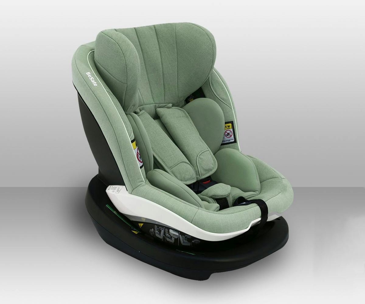
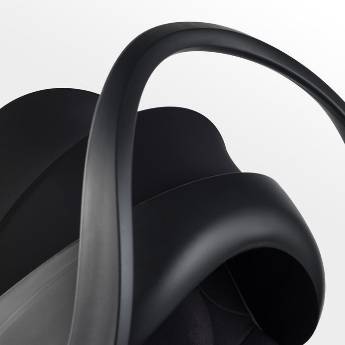
BeSafe create safe products beyond just regulations and lab tests. They offer Scandinavian premium design and smart functionality.
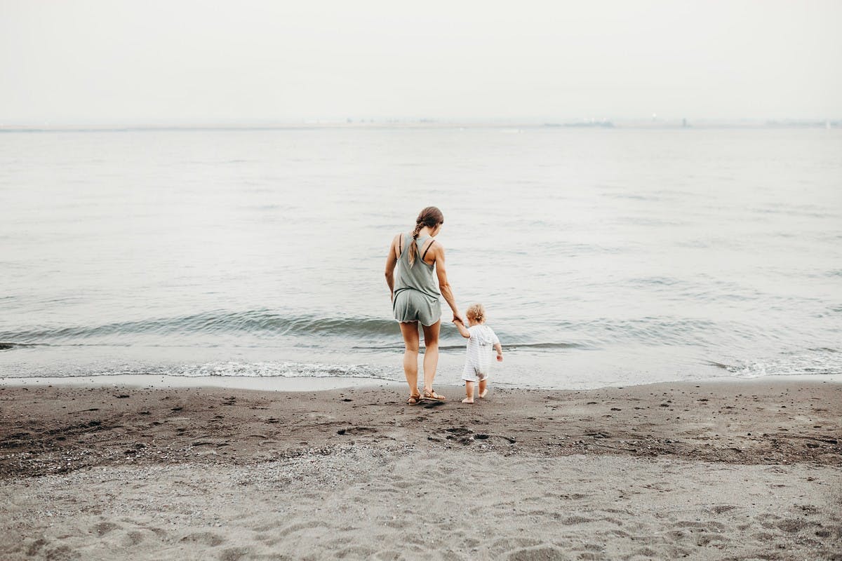
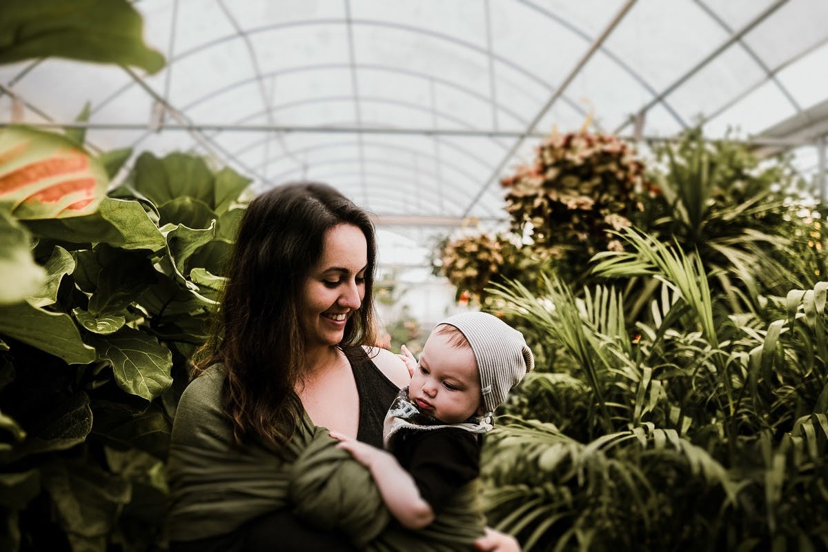
The rebranding and strategy is clear, simple and operational. The trusted safe mobility expert - in the car and outside. The purpose is to give parents and children the trusted safe mobility solutions, so that they feel free and confident to explore life’s adventures and create memories as a family.
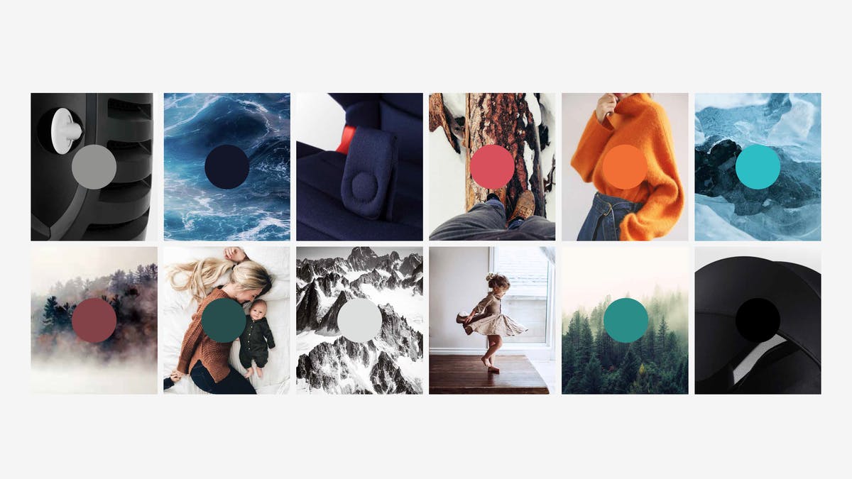
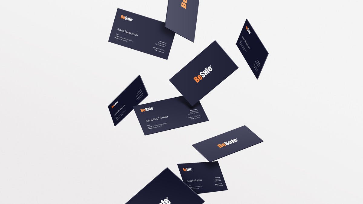
To reach the new brand values – include uncompromising, knowledgeable, caring, down to earth and passionate – we had to make the overall impression of the brand lighter and more human. Less black and orange. Less car safety/crash testing.
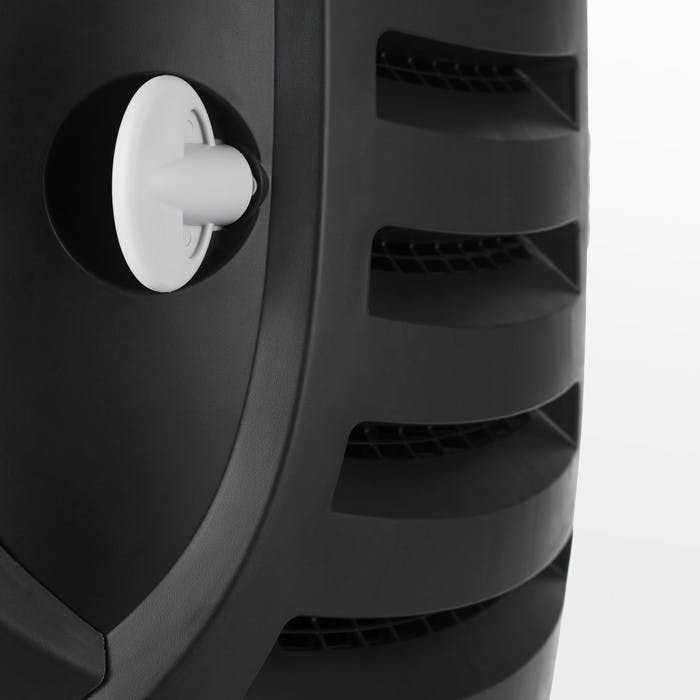
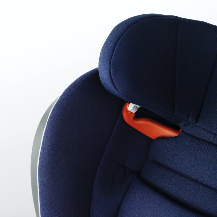
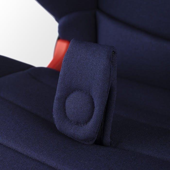
The result was to soften up the orange brand color and combining it with dark blue and light grey, in stead of black. The logo type remains untouched, but we did get to soften the colors. The typography is a light sans serif font for technical information and an editorial serif font to substantiate the brand values. This gives the brand a softer more relatable approach, still being focused and the safety expert.
Work done for Tegneren.
My role:
Visual Identity.

Our brand ambition is to be the most desired, preferred, and trusted brand in baby and child mobility, recognized for its focus on safety, smart design and comfort.